Node coloring¶By default, the nodes in the Mapper output are colored by the average filter value: for all points in a node, the average filter value is computed, and then a color map is applied to all nodes. Currently, the color map is Matplotlib’s default “jet” color map, with a range from the lowest to the highest filter value of all points. Low filter values are represented by blue, high filter values by red. 
The “jet” color map The Python Mapper GUI allows user code to assign arbitrary scalar values to nodes for a different coloring. Code can be entered in the field “Node coloring” in Step 5: 
As in the Input data processing and Filter processing examples, any Python code can be entered. In particular, new modules may be imported for more complex procesing. The following variables are predefined when the Python interpreter processes the code:
Only one of the variables As a simple example, the line name = 'z-coordinate'; point_color = data[:,2]
colorizes vector data according to the 3rd coordinate. With this coloring, the horse example looks like this: 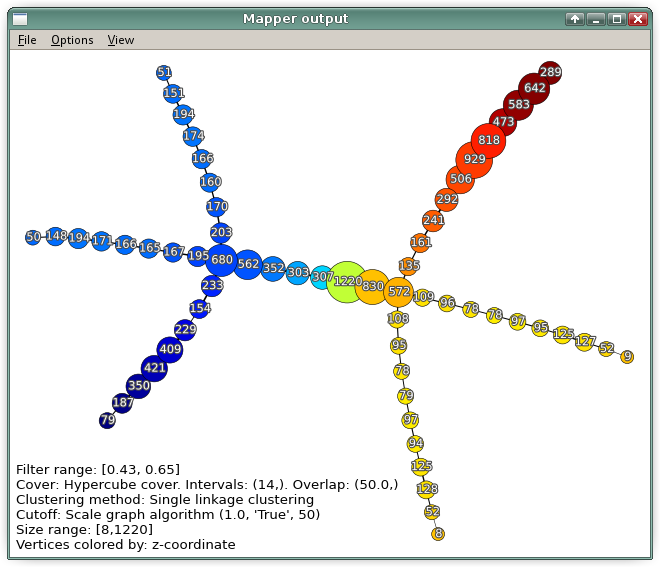
Horse colorized by the 3rd coordinate. The color map ranges from dark blue at the tail to red at the head. |
|